ARTIST STATEMENT - ABOUT THE COLLECTION
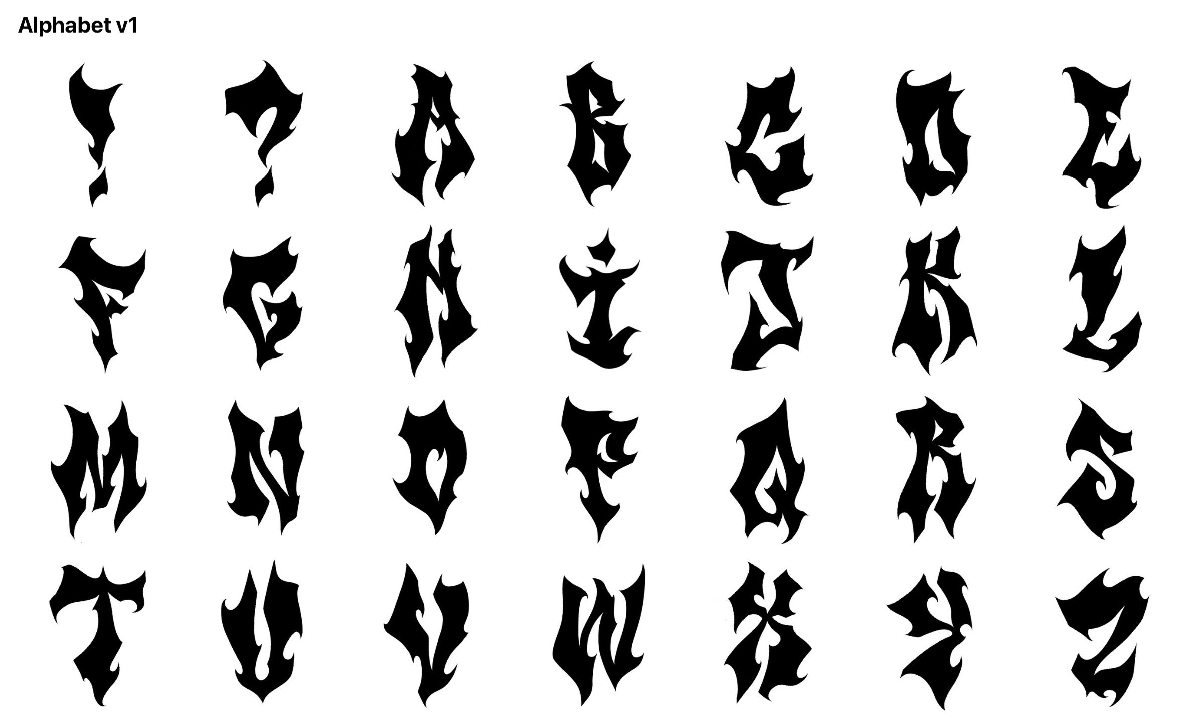
This alphabet is foundational in my letting style - much of the work that I do and will continue to do will trace inspiration from it. As an artist and designer, I’ve created this alphabet grounded in my love for letters - rooted in my practice of graffiti, sign-making, branding, graphic design, typography, symbolism, fine art & fashion. I do not claim to be a ‘real graffiti artist’ or to be anywhere near proficient in street art as of right now. Aspects of my work can be considered ‘graffiti’ but I don’t compare myself to the real graffiti artists out there. All my love, gratitude, and respect go to the real artists and crews who get up in the streets on a daily/nightly basis all across the world. With humility and respect, I don’t currently have the mental and physical capacity to be UP in the streets yet, but maybe one day. For now, I occasionally paint outside but I’m not part of a crew or consider myself in the local scene. Overall I’m not really interested in graffiti politics and I don’t do beef. I do my best to immerse myself more into painting outside with the right efforts to produce good, clever art and build a graffiti community based on appreciation and respect for the craft and all other artists.
Some of my graffiti/street art inspirations growing up in France: TERAK (THP) ; ROUL (BDV) ; BEND (BDV); FASER (BDV); RAEK (LPC); SMEK; ULCER (LPC); MOXE ; OCLOCK ; COPE2 ; BANKSY ; KAWS; TRANE ++
Some of my favorite graffiti/street art artists at the moment: SUPS; SAVIE; SWILE; ACER; BENSON; GKODE; LOFI; REVOK; SABER; VOGUE; PESKADOR; BUKUE; KUFUE; CHONDON; SHIDO ++
My main intention to create an alphabet is to establish a basis for a style of lettering that captures my essence, used as a backbone for many projects and will continue to use in an evolving manner. I designed these letters with the intention to use them as isolated studies and personal reference points, to ultimately be enhanced in different ways. Key details from this alphabet have been will be carried throughout most of my lettering work moving forward. I also want to provide a solid reference of inspiration for any artists that may resonate with my work, especially the youth. The vision was to produce a style of lettering that captures the essence of my current personality and interests in art/design symbolism during this time of my life. In the future I want to look back at this body of work as a landmark, having further evolved and improved since. The v2 Alphabet will be better and will release in due time of growth.
I originally discovered a love for typography in elementary school in the East Bay, doing lettering for a yearbook cover. My family and I moved to Southern France at age 11 and began painting graffiti as a teenager when I was 12-13 years old, inspired by my friends, with a hunger to get better, fast. I easily fell in love with this thrilling, therapeutic art practice of enhancing the letters and language I used on a daily basis. It became more than a form of expression, it was a way for me to find and build identity - something I craved to developed dearly, being a child of Algerian immigrants still finding my place in a wicked world. At the time, I was painting a lot outside and in my school on walls, but I was always better with pencil/pen/marker on paper and canvases. I quickly got some of my best tag pieces printed on t-shirts as I got more into fashion. My tag names changed over time as I evolved into my teenage years and I significantly progressed.
Around age 15-16 my interests shifted in building my identity and expressing my creativity through fashion and graphic design. I began studying streetwear and collecting apparel brands like Stussy, LRG, Ecko, BBC/Ice Cream, BLVCKSCVLE, Dimond Supply, Pastelle, etc. I was always eager to create my own brand, and waited to create the ‘right’ concept, something new and different. When ‘à l’aise’ arose as an idea, I felt the need to incubate it into a brand, different from others. After creating the first typeface it took me a while before to produce the first shirt. I eventually did, and realized that i wasn’t interested in producing high-volume products. Discovering the basis of my spirituality and understanding of self through Vipassana in my early 20s brought me to build the brand idea into something beyond just a brand, in tune with Earth, infusing holistic lifestyle concepts, restorative work, and community initiatives. The vision ultimately became building a brand that explores ‘the cool in doing good’ - as brand ‘in parenthesis, focused on producing products & services to positively engage with the world, bettering the human experience by doing better. Since 2013 I’ve been developing “AH-LEZ” as a branded project, experimentally evolving over time, to one day officially launch as a legit company at service of the world.
During this time I also developed a symbolic color palette(White/Black; Grey; Blue; Green; Brown), embedded in my work in a focused and developing manner. I created POC1 (Proof Of Concept) to ground the palette in a formal study, an exploration to explain to others why I live and create through these colors. I was eventually able to use this color palette as a bridge between fashion to the spaces of street art and fine art. I started to used my understanding of fabrics and stitching skills to create art pieces to hang. I expanded my capacity to create letter pieces with chain stitch-embroidery, which i learned & practiced while working as a denim tailor for Levi’s in 2018-19. I picked up graffiti again at the very end of 2020, and practiced heavily throughout 2021, picking up where I left off. I was fortunate to manifest a space with walls to practice daily. This dream come true has allowed me to progress with diligence and explore my style, all rooted in my color palette. I’ve found myself now at a piece of seeing the full circle of my identity to this day, and what’s to follow next.
The bigger picture of my creative career involves collaboration, physical and digital work, create street art, adornments installations, place my work in homes and galleries, all while learning new skills and improving my craft. I’ve been able to articulate my lettering work with spray-paint on walls, and hand-painting on clothing, patchwork, chain-stitch embroidery, and other mediums. I want to expand on those practices, especially with air-brush & stencils. Overall I want to focus more on my skills individually to become better and be able to seamlessly bridge them. This flows in parallel with my work in graphic/fashion design and beyond, especially with hosting and curating local/virtual activations to provide memorable experiences.