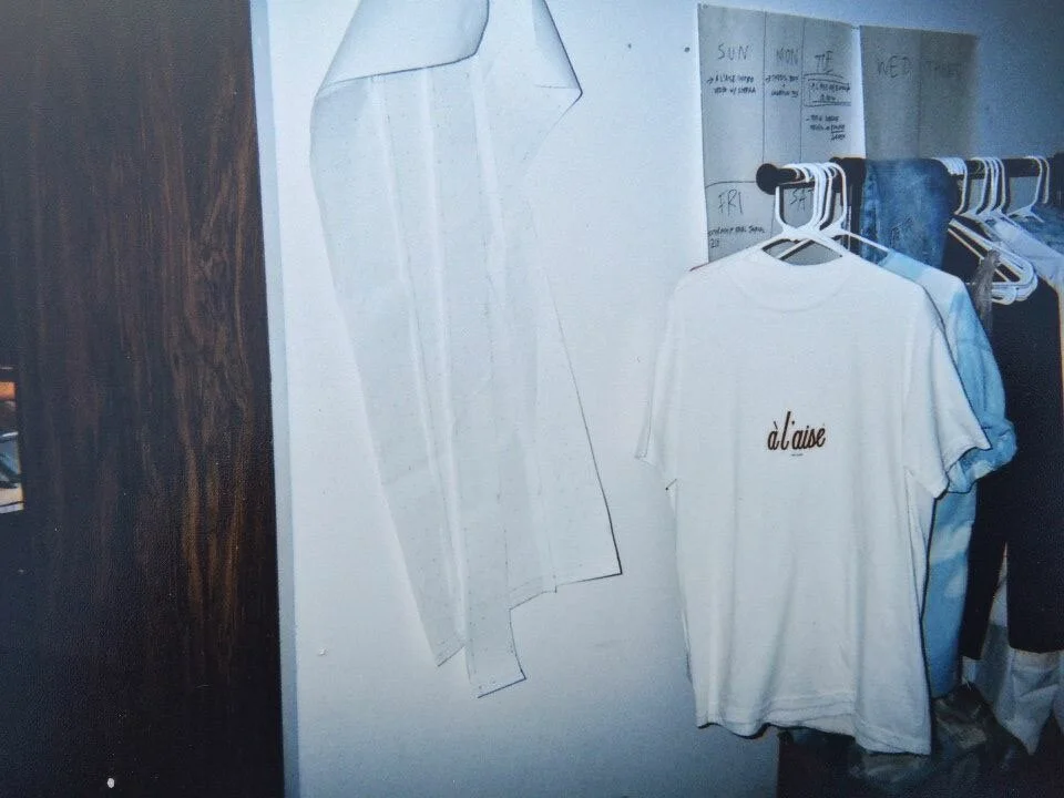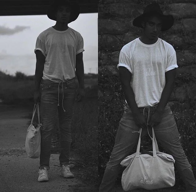

*brand in development since 2014
(AH-LEZ) is a ‘lifestyle design’ brand rooted in street art, founded on a philosophy of translating struggle into ease to empower and serve our communities.
“ah-lez” is the pronunciation of “à l’aise”, French for “at ease” - referring to a state of being, implies and entails a journey of discovery - finding, understanding & practicing balance in the essential elements of life, becoming ‘at ease’, in one’s own definition of ‘ease’.
The accented, double-spiraled, “@” sign, aka the “AH!'“ logo, is the core glyph of (AH-LEZ). It’s a symbol of sovereignty and self-sufficiency to be experienced and shared in different spaces. It holds a sense of belonging and purpose to be carried through the impermanence of existence. In literal translation, “à” in French means “at/@” in English - this double entendre is personified with the symbol, carried by the slogan: “never easy… to be at ease”.


![Cap. 3 [*8 pièces] 🆕♻️
*pièces uniques - recyclées via @secondbloomsupply
graffiti & sérigraphie fait-main/maison sur des vêtements vierges/vintage de haute qualité
~
1. navy blue sweatshirt (L) $60
2](https://images.squarespace-cdn.com/content/v1/5ce6e23f5b0d66000132592f/1690764209582-J24DB4I3Z7XHAGBSZZZ0/image-asset.jpeg)


